MOBILE & DEVICE EXPERIENCE

Responsive Web Checker

Check baseline responsive-design signals and how prepared the website is for mobile devices and tablets.

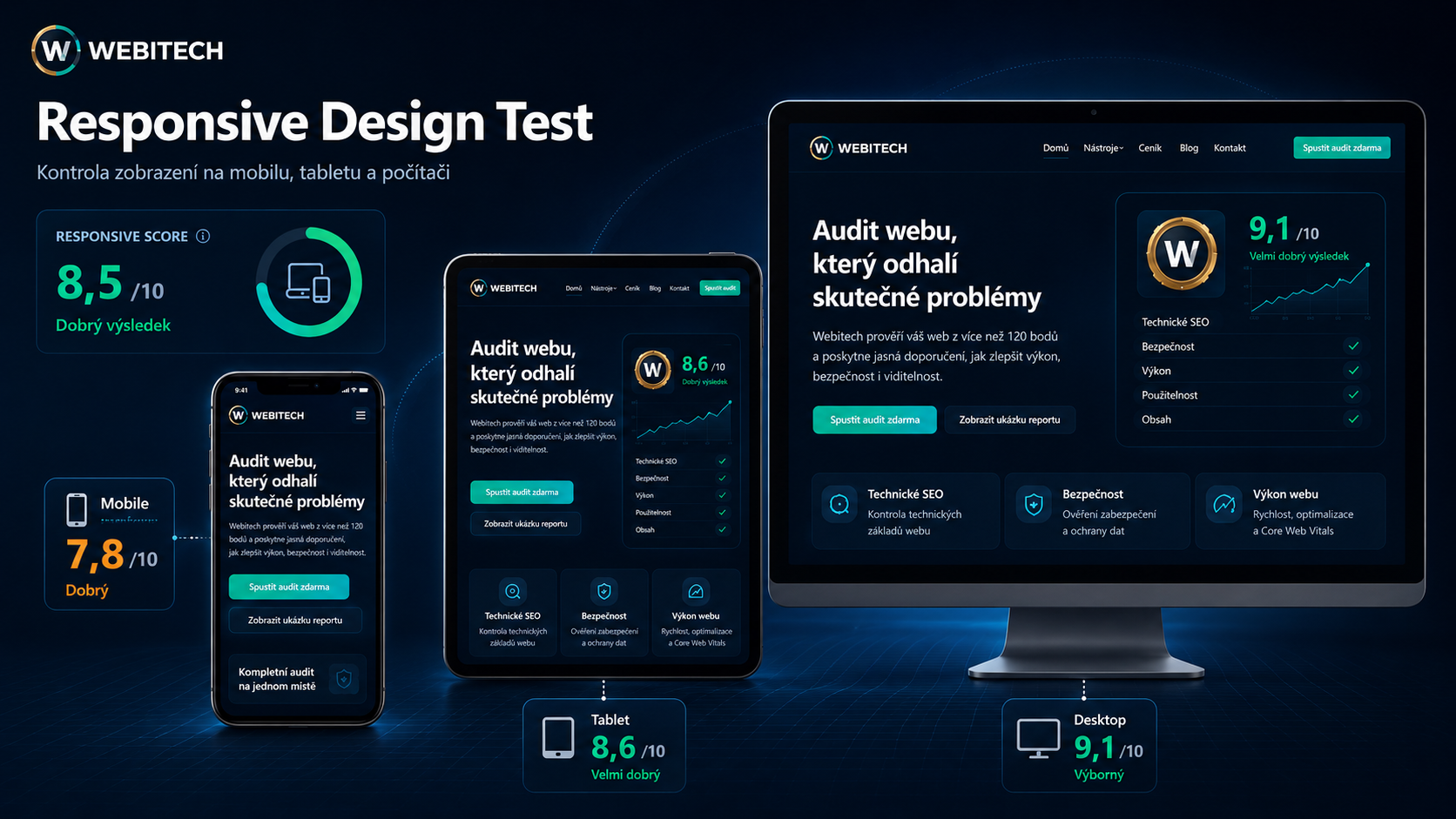
Webitech Responsive Web Checker showing one website across desktop, tablet and mobile devices
MOBILE-FIRST ADAPTABILITY

What the Responsive Web Checker tells you

Responsive design determines whether the same public website remains usable and readable across phones, tablets and larger screens. Webitech evaluates baseline mobile-readiness signals that can be observed automatically from the website code and selected performance signals.

01

WHAT THE TEST CHECKS

The checker looks for a mobile viewport, responsive-image signals such as srcset or picture, responsive CSS breakpoints / media queries, baseline mobile form usability and, when PageSpeed is connected, complementary Lighthouse mobile signals.

02

IMPACT ON THE COMPANY

Weak responsive behavior can increase bounce rate, reduce conversions and make the site harder to use on the devices where many visits now happen. A stronger responsive foundation improves readability, navigation comfort and trust on small screens.

03

WHY IT MATTERS

Customers often decide on a phone first. Responsive quality therefore affects discoverability, brand impression and conversion readiness at the same time. This test is informative and does not replace real visual QA across devices.

iThe test does not emulate every device model. It evaluates public code and selected mobile-quality signals, and should be complemented by a real visual check.

This is only one part of the digital footprint.

Run the complete Webitech assessment to see the wider technical, trust, content, data, social and AI context.

Run complete Webitech Audit →