
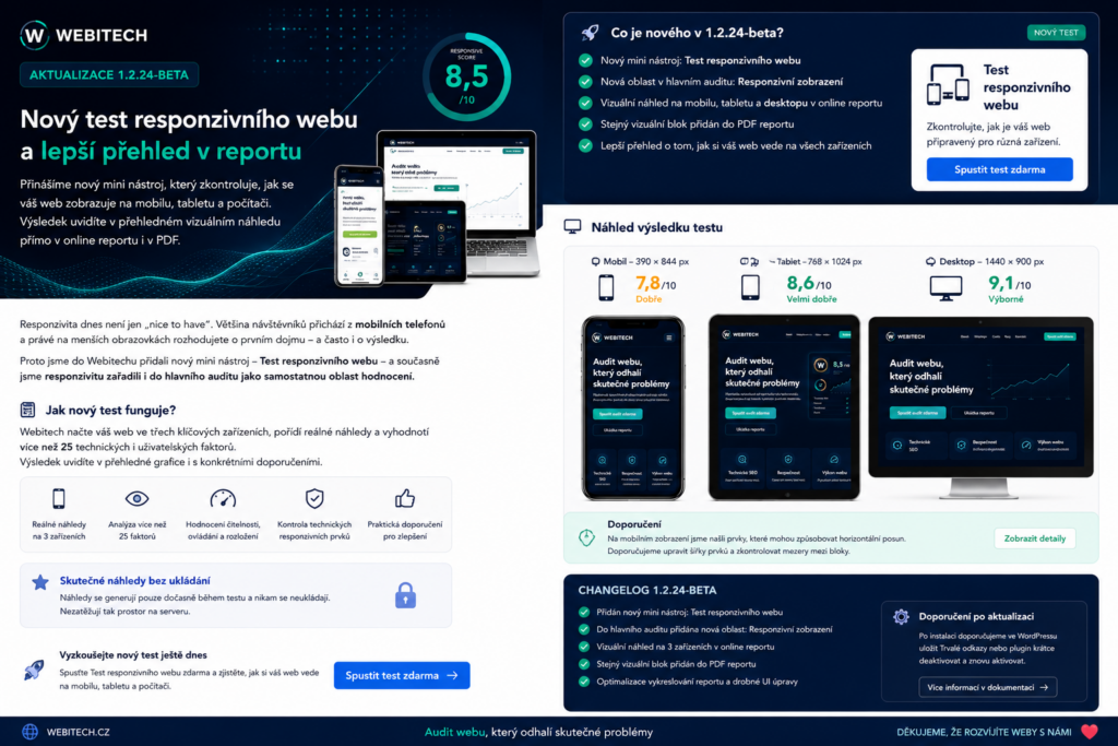
Webitech continues to expand its digital footprint audit. The new 1.2.25-beta release introduces another important area of evaluation: responsive website display on mobile, tablet and desktop devices.
It is no longer enough to know that a website has the correct technical configuration. What also matters is how the website actually behaves on different devices and how it appears to visitors.
That is why we have added a new Responsive Website Test to Webitech and have also introduced responsive design as a separate area within the main Webitech Audit.
One Website, Three Different Screens
A website may look perfectly fine on a large monitor, while the experience on a smartphone can be completely different.
Content that is too wide, poorly adapted images, incorrectly sized forms or elements that do not fit within the screen can significantly reduce usability.
Webitech therefore now works with three main viewport sizes:
Mobile – 390 × 844 px
Tablet – 768 × 1024 px
Desktop – 1440 × 900 px
The result combines technical evaluation with a visual overview of how the website appears across different devices.
What Does the Responsive Website Test Check?
The new test does not focus on just one parameter.
Webitech checks areas such as:
mobile device readiness,
responsive images and media,
layout adaptation across different screen widths,
basic mobile form usability,
available mobile quality signals,
overall readiness of the website for smaller screens.
The result is then converted into a separate Responsive Display Score from 1 to 10.
A Real Website Preview Directly in the Results
One of the main new features is the ability to generate an actual preview of the tested website during the test.
Webitech can temporarily render the page as:
mobile, tablet and desktop.
This means users do not only receive a technical message saying that, for example, there may be an issue with the mobile version.
They can also get a visual overview of how the website actually looks on each type of device.
Previews Are Not Stored Permanently
When designing this feature, minimizing stored data was also important to us.
Generated previews are therefore used only for evaluation and for displaying the test result. They are not intended for long-term storage.
This prevents testing from turning into an unnecessary archive of screenshots and helps keep the system efficient even when a large number of tests are performed.
The same principle is also used when generating reports.
Responsive Design Now Affects the Main Webitech Score
The Responsive Website Test is not only available as a separate free tool.
The Responsive Display category has also been added to the complete Webitech Audit.
The Webitech Score can therefore better reflect the fact that a strong digital footprint is not only about SEO, security, content or AI readiness.
A website should also be comfortable to use on whatever device the visitor happens to be using.
As part of this expansion of the main evaluation system, the methodology was also updated to:
Webitech Methodology 2026.08-R7
Responsive Results Are Also Included in the FULL Report
The results of the responsive test are also included in the complete FULL report.
Clients can therefore see in one place:
the overall Webitech Score,
results for individual evaluation areas,
detected issues,
specific recommendations,
the Responsive Display Score,
a visual overview of mobile, tablet and desktop versions.
This makes the report easier to understand even for users who are not familiar with technical terminology.
Instead of receiving only a warning about a problem, they can better understand how the issue may affect everyday use of the website.
Responsive Overview Also Included in the PDF Report
The new category has also been added to the Webitech PDF report.
The PDF can contain a dedicated section focused on responsive display, including the resulting score, key findings and a visual overview across devices.
Here too, generated previews are used only for the time required to create the result.
What If a Real Preview Cannot Be Generated?
Real visual rendering may not be available in every situation.
If the system cannot create a preview, the responsive test will still continue to work.
Webitech will still evaluate the available technical signals and display the resulting score.
The visual section will then use an alternative presentation method, and users will not be given misleading information suggesting that a real preview was generated when it was not.
Webitech Now Adapts Better to International Visitors
Version 1.2.25-beta also introduces an improvement to the way Webitech handles language selection.
During a visitor’s first visit, the system can use available information about the visitor’s country.
If the visitor is located in the Czech Republic, they remain on the Czech version.
Visitors from other countries can automatically be redirected to the English version of Webitech.
If country information is not available, the browser language can be used as an additional signal.
The user’s manual CZ / EN selection always takes priority.
Once a visitor chooses a language manually, Webitech remembers that preference and automatic language detection will no longer override it.
The solution is also designed so that both language versions remain properly accessible to search engines.
Why Responsive Design Matters
For many customers, a mobile phone is the first place where they interact with a company.
If a website is difficult to read, buttons are hard to use, content extends beyond the screen or forms are uncomfortable to complete, visitors may leave very quickly.
Responsive design is therefore not only about appearance.
It can affect:
user experience,
website trustworthiness,
conversion rates,
form usability,
website performance on mobile devices,
the overall impression of the company.
The goal of Webitech is therefore not only to detect a problem, but also to show it clearly and explain it in a broader context.
Try the Responsive Website Test
The new Responsive Website Test is available among the free Webitech tools.
Simply enter your website address and within moments you will receive an overview of key responsive signals and an assessment of how well your site is prepared for different devices.
The complete audit then combines this area with other parts of the company’s digital footprint, including technical condition, SEO, security, trustworthiness, content, data quality, social footprint and AI readiness.
Webitech – Analyze · Improve · Grow